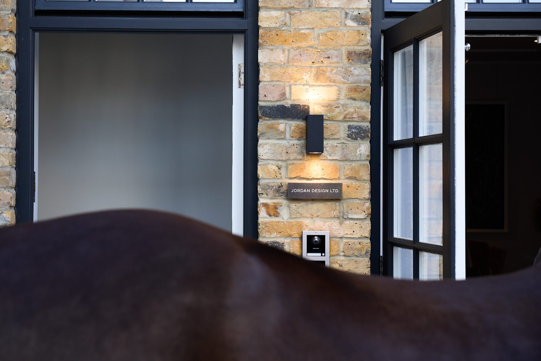
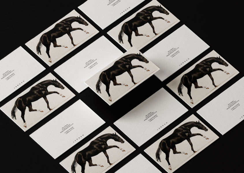
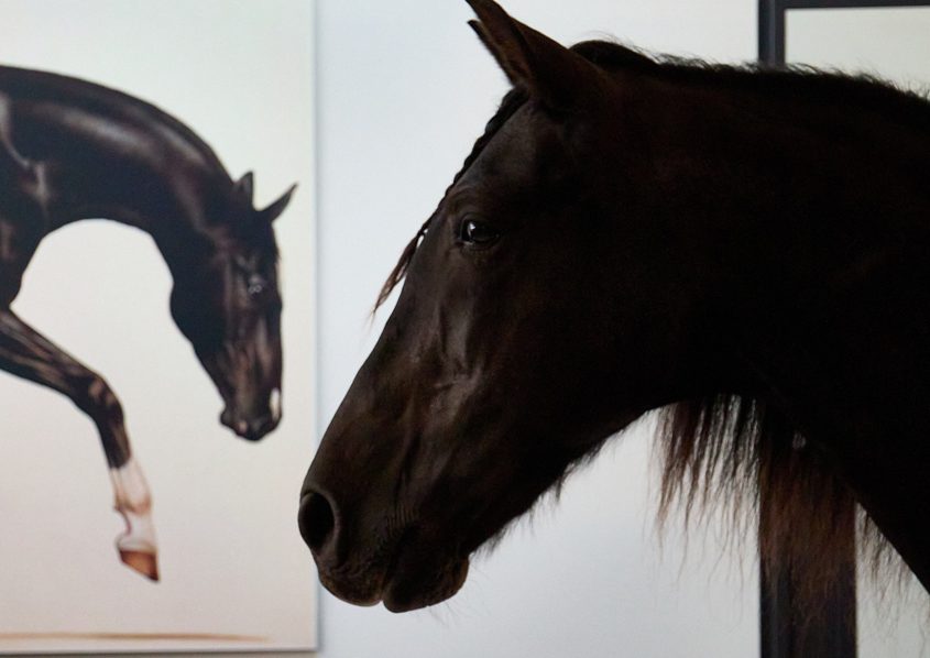
Straight from the horse's mouth: Some of the thinking and symbolism behind the new Jordan Design brand mascot.

15/9/26

Thoughts

By Ben Jordan, Founder

What is it about horses that evokes feelings of such positivity?

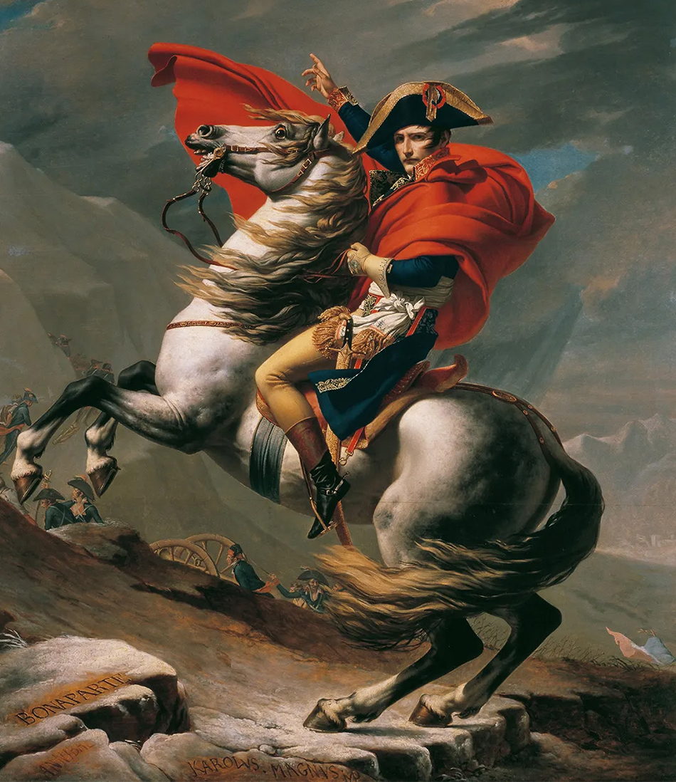
Could it be their undeniable beauty?  Images of beautiful and noble horses are scattered throughout art history.  Think of the magnificent, wildly rearing horse in David’s Napoleon Crossing the Alps (1801) that steals the limelight from Napoleon himself.  Or the quiet elegance and strength of John Collier’s horse in Lady Godiva (1897).  The horse, a potent symbol of beauty, can be seen across all cultures and all time, from the earliest Stone Age cave paintings to our own Silicon Age.
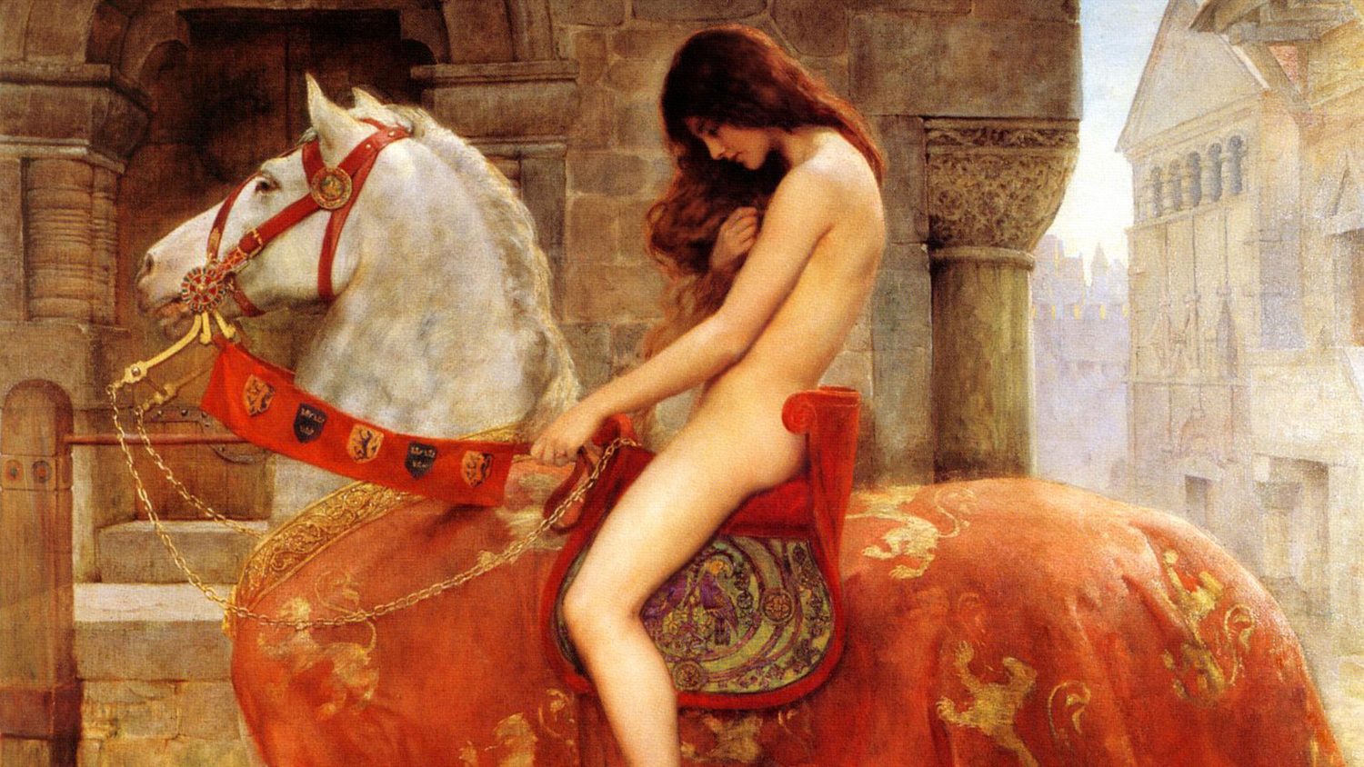
But horses aren’t just beautiful.  They combine enormous strength with delicacy and grace; they are humble but quietly assertive.  Human history and culture have been shaped by the horse.  Their ability to carry us shrank the world and enabled us to build empires; their ability to pull heavy loads created economies and cities built on agriculture and trade.  The fate of mankind has been inextricably linked to the horse, and it is no wonder that they have become universal symbols of both power and beauty.
 
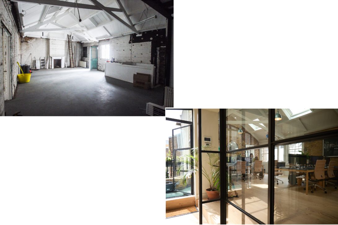
In 2023 Jordan Design moved into its new home at 18 Grafton Mews.  Originally, a mews was a row of stables and carriage houses with a hayloft and living quarters above.  So, a couple of hundred years ago, our studio was home to horses that pulled the carriages of the posh people living on Fitzroy Square. 

To celebrate the move to our new home and mark the beginning of our post-Covid renaissance, we started the painful process of reviewing our corporate identity and website.  Out of that process came the genius idea that we had a unique ‘licence’ to adopt the Horse as our brand mascot. 

It works as a metaphor for Jordan Design on so many levels. Our new home was once home to horses.  In all the work we do, our first objective is to create a beautiful aesthetic, but our strength as designers lies in the practicality and the utility our designs bring to our clients’ brands.  We approach our work with a mixture of confidence and humility; we know that we are there to serve the client and their brand, not the other way around.  We are uncomplicated and prefer common sense to hyperbole – you could say we have horse sense.  We work in the world of luxury and premium brands; the horse is no stranger to this world and has long been a symbol of these values.

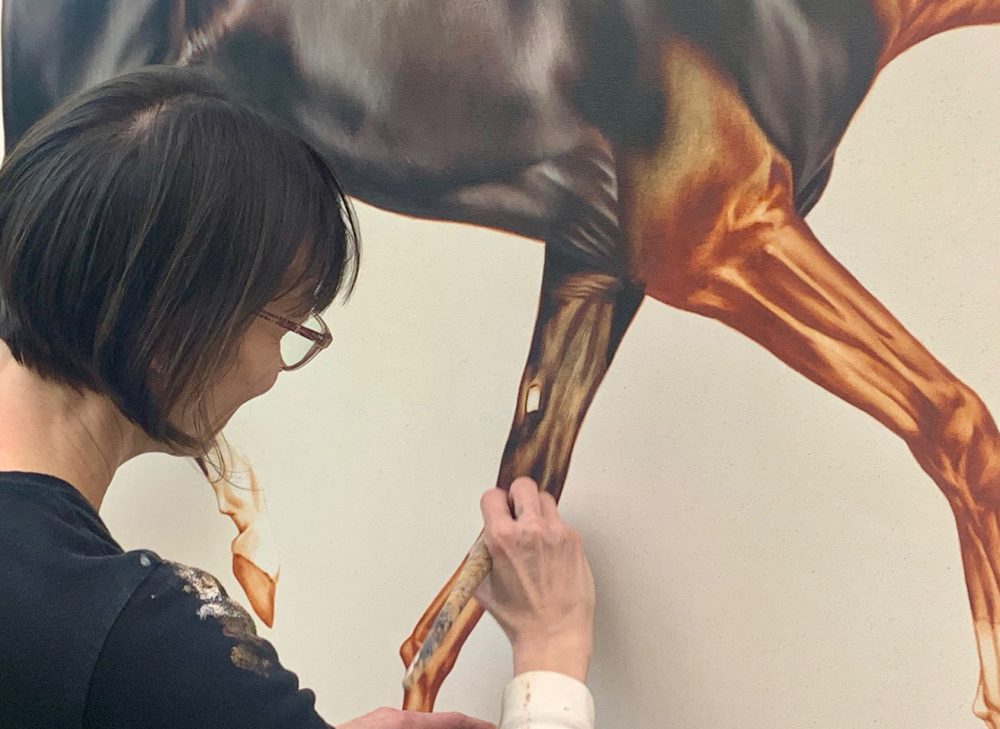
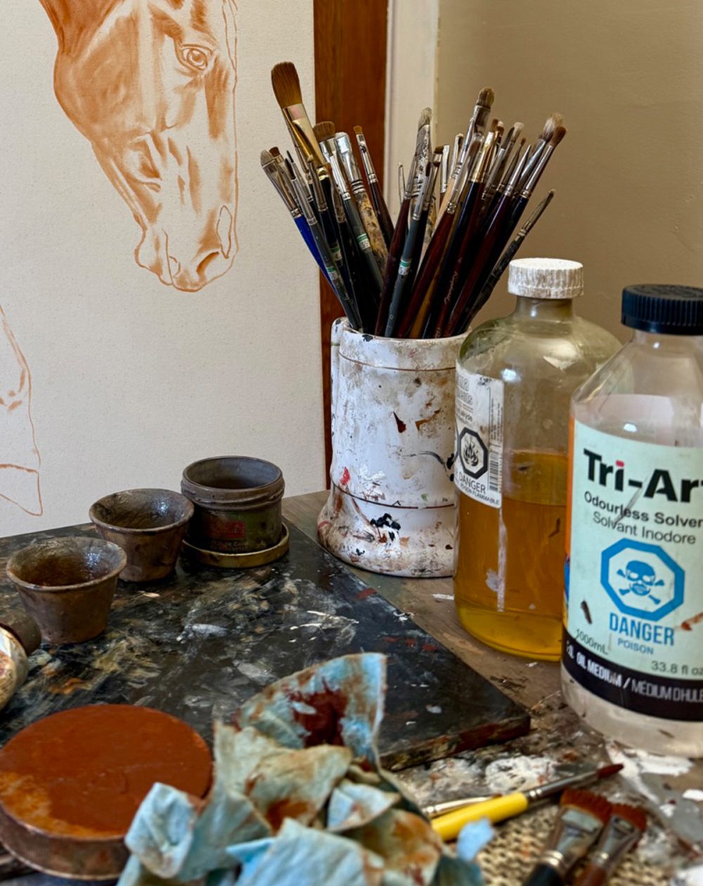
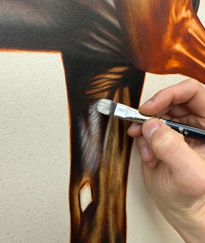
We love our new mascot.  She’s called Pooka and was painted for us by a brilliant young Canadian artist named Éloïse Brodeur.

Pooka has strength, elegance, and beauty, and she carries herself with confidence and yet has an air of humility about her.  I’m a firm believer in serendipity, so the fact that the launch of our new website and corporate ID should coincide with the 2026 Year of the Fire Horse feels particularly auspicious – a symbol of energy, independence, creativity and forward momentum that seems entirely fitting for the next chapter of our own journey.